AS AN INTERIOR designer, I often emphasize the fact that there are two words related to my field: design and decorating. I’m known to say “There are two words because they are two distinct things.” Here, in this delightful project that I am pleased to share, is an example of how decorating can sometimes be enough to change the entire design.
When I first walked into this home in Carter Plantation, I certainly didn’t think “this house needs a makeover.” The owner’s taste is impeccable and that showed even early on in the project. But on our first walk through the kitchen and living rooms, I realized why I was there. The entire house was clad in pine molding. It was not antique heart pine, mind you, but the regular yellow stuff, and the brick inside the house had been washed with a dark brown stain—making it darker than it originally was.
The couple had moved into the home in a fast sort of way, settling here after a whirlwind househunt in the area. After getting settled, the dark countryside features of the house began to wear on them and we met when it was time to implement some changes. They wanted to lighten the overall look of the place and bring it up to date, but were considering more of a remodel than I suggested. The heaviness of the pine trim throughout the house was too much, but altogether the floor plan is comfortable and there was not a need for extensive renovations. Everything was accomplished with thorough, thoughtful redecorating.
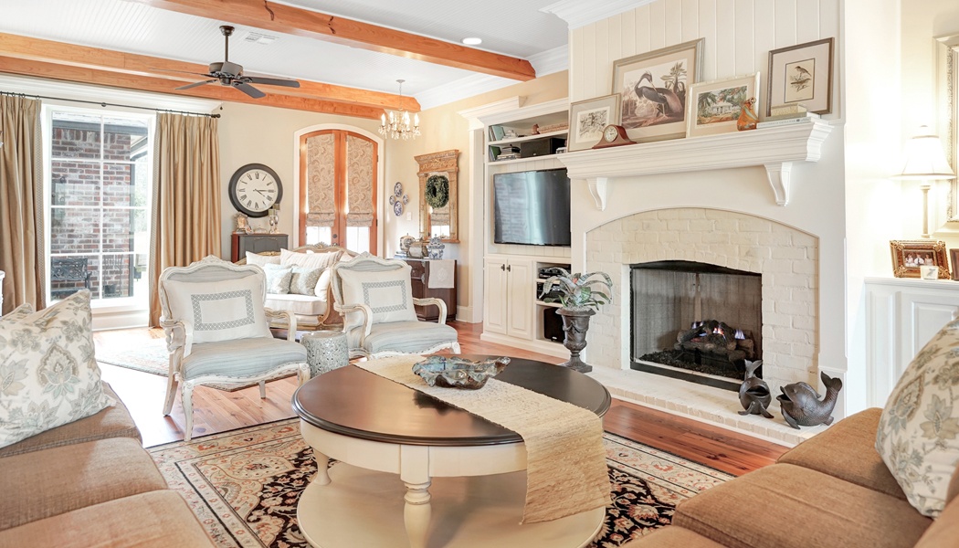
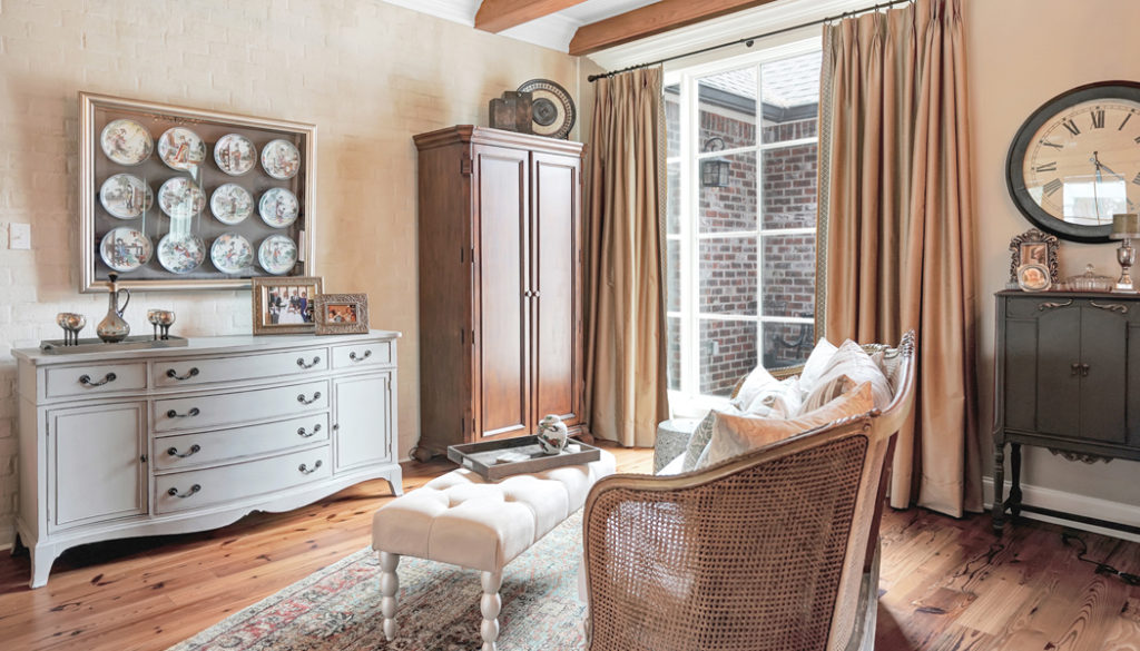
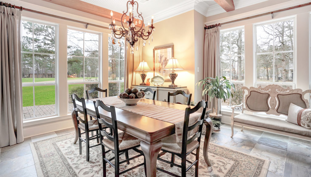
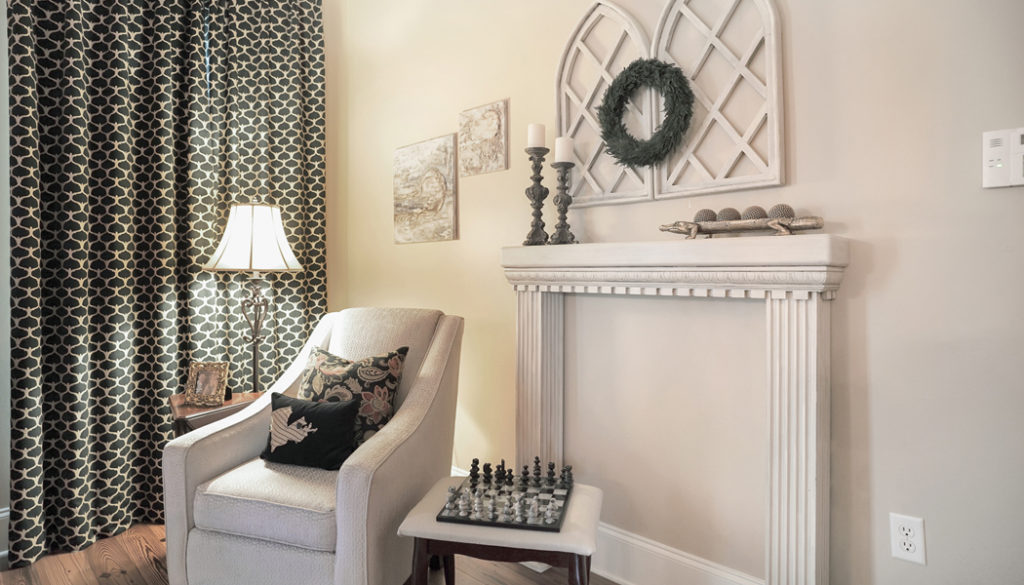
With the exception of the ceiling beams, the wood was removed and fresh white trim was installed around the windows and doors. Keeping the natural wooden doors and beams provided a hint of the surroundings. After all, the house is situated in a grove of pine trees overlooking the golf course. Relocating some dark furniture into a newly-appointed media room gave space for a more defined sitting area near the front window where the bar cabinet remains. A coat of paint brought an old dresser into its second phase of life. Hanging above the dresser is a unique collection of Japanese plates, which in total tells a story that no one can interpret but that everyone finds quite enchanting.
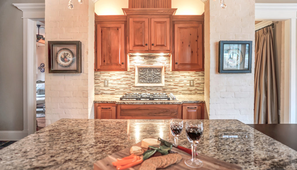
A double-sided brick wall divides the kitchen and living rooms. It was a heavy, dominant feature on both sides, but now it’s a beautiful, elegant background that is reminiscent of a stone wall, having been mortar washed in a light cream color. Adding bits of cream and gold throughout the home kept the color palette consistent and hints of the soft blue that pop up in artwork bring a coastal airiness that is fitting for a couple who enjoy traveling via their sailboat. Heavy blinds were removed and replaced with linen panels that can be pulled open for a full view of the golf course. A few old pieces of art were refreshed with new framing and mixed into collections with newer pieces that have been picked from their travels. The husband’s aunt was a world traveler who left her treasures to them and, as they were uncovered, we found places throughout the home for all of them. Pottery from Hawaii sits next to postcards from coastal museums and an old collection of encyclopedias gives gravitas beneath sailboats.
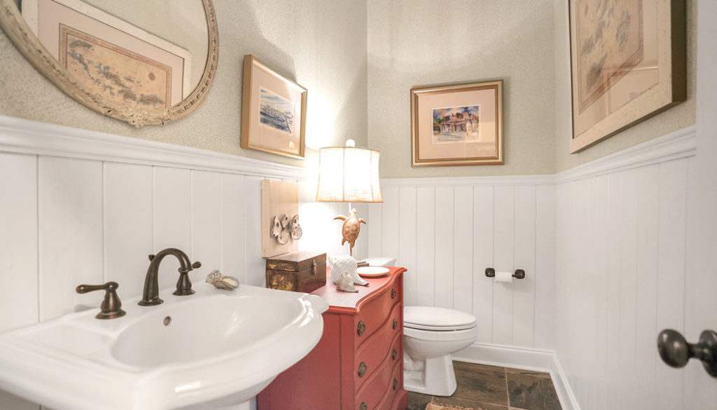
The coastal theme was embraced full force in the powder room where it’s always nice to have some fun. White v-board wainscoting plus sky blue wallpaper take a hallway mainstay from plain to pleasant. Her grandmother’s mirror hangs above the sink and a map of Tortola, a favorite sailing destination, fills the wall.
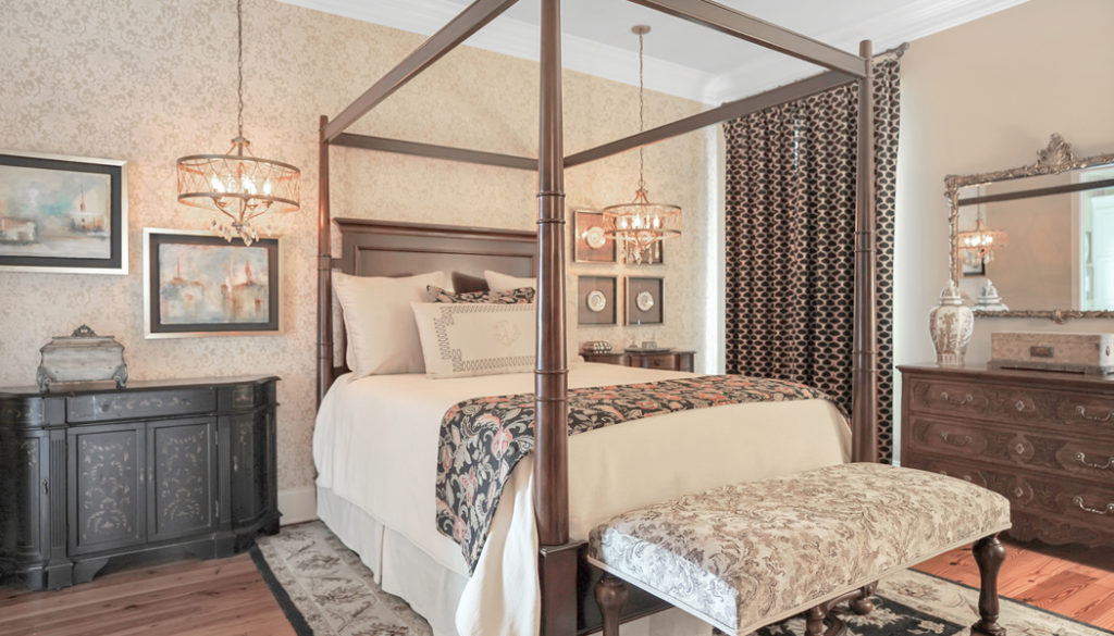
In the master bedroom, the couple wanted to remove the flat-screen television and create a more peaceful retreat, specifically with a comfortable chair for reading. Creating an accent wall with a beautiful gold damask wallpaper gives a timeless elegance to the space, which is juxtaposed with bright contemporary artwork above the nightstand. This focal point is visible from the main room when the door is left open and the pop of blue gives balance to the entire space. More of the exotic heirlooms are on display, from the collection of gold-rimmed plates to the antique ginger jars on the dresser. Using a wide-striped tonal wallpaper in the master bathroom continues the subtle shimmer of gold and cream that visually defines the master suite.
As a designer, I find that for the ultimate satisfaction for my clients, there must be meaning in their spaces. To accomplish a specific style or look with a mere shopping trip will never be a fully completed design. The contents must be personal or they will eventually become disposable. Here, where the residents are surrounded by family history and reminders of the joys in their lives—from grandchildren to traveling – we’ve gotten to complete fullfillment.

